
Back to Portfolio
Digital Banking
Mobile App
Design System
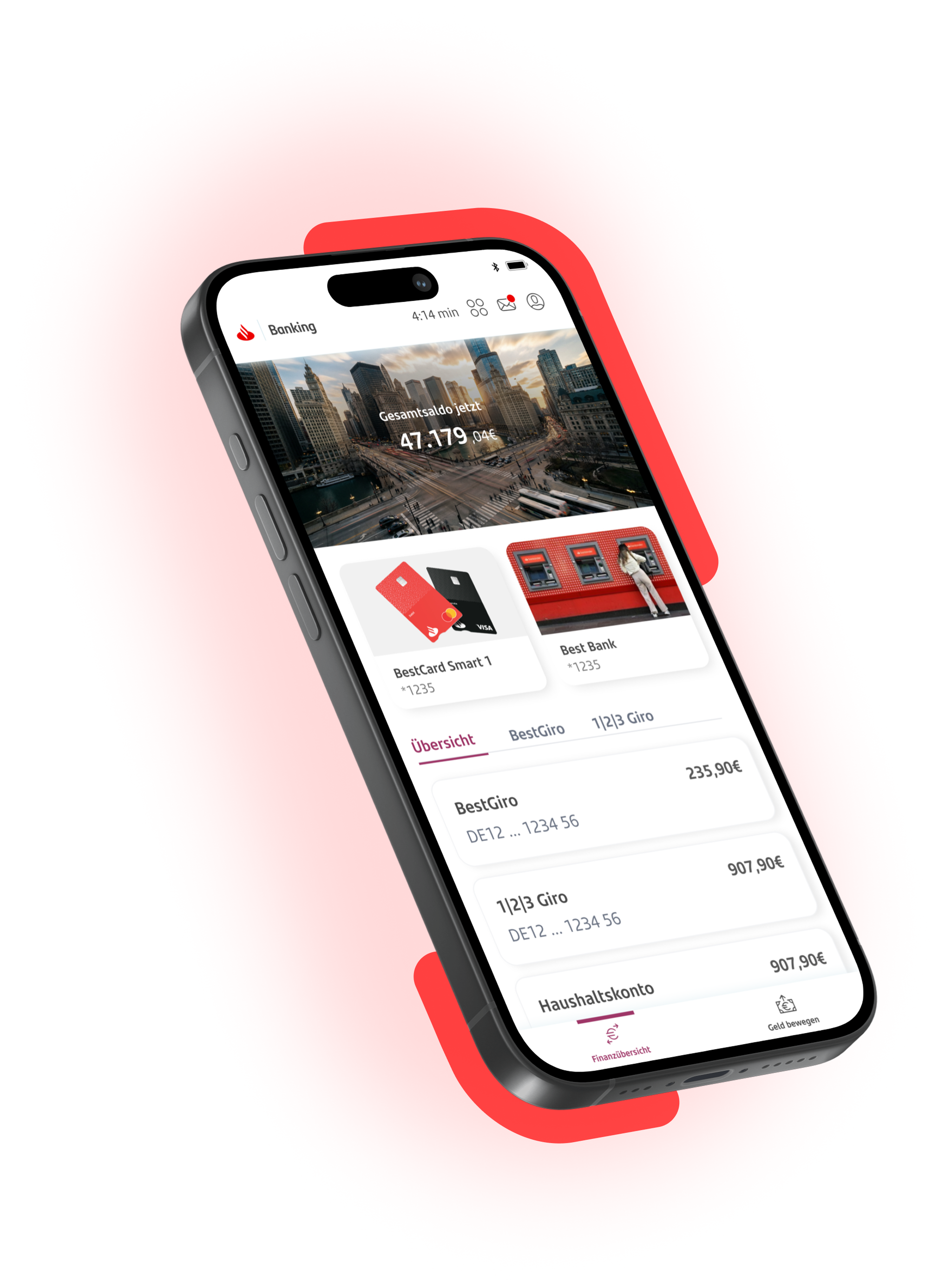
MySantander App
A consolidated mobile banking experience that replaces multiple fragmented tools with one coherent, scalable platform for customers and internal teams.

Context
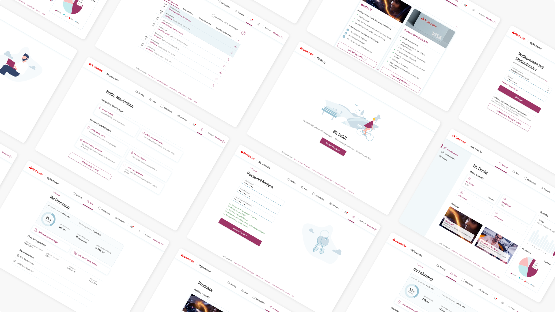
Santander Germany operated multiple digital tools with different interfaces, patterns, and logic. Users constantly switched between them, struggling to form a consistent mental model and often abandoning tasks due to fragmentation and complexity.
Redesigned the full mobile banking experience, creating a unified navigation system that brings all services together into one coherent, scalable structure—replacing multiple disconnected entry points with a single, intuitive flow.


Role
UX Designer, UI, research, user flows, design system.

Timeline
2021 - 2024

Team
Product, engineering, brand & compliance teams across multiple workstreams.

Scope
Transform a scattered ecosystem into one unified, intuitive banking experience.
Impact
Redesigned the full mobile banking experience, creating a unified navigation system that brings all services together into one coherent, scalable structure—replacing multiple disconnected entry points with a single, intuitive flow.
Key Problems Identified
For users

Inconsistent flows and terminology
No clear structure across tools
High cognitive load during multi-step tasks
Confusion between overlapping features
For the business
Hard to scale new features across products
Increased support due to interface-driven issues
Redundant development effort
Weak alignment with brand and accessibility standards

My approach
5
Collaborate across product, development and compliance
Aligned technical feasibility, regulatory constraints and delivery phases to ensure the new experience could realistically scale.
3
Redesign and adapt the design system to the german market
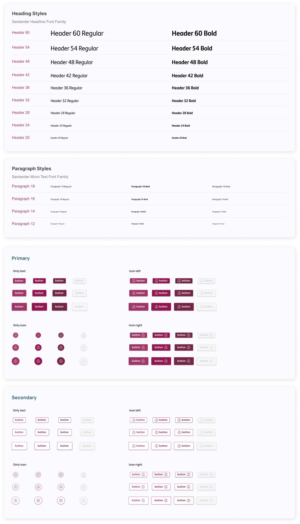
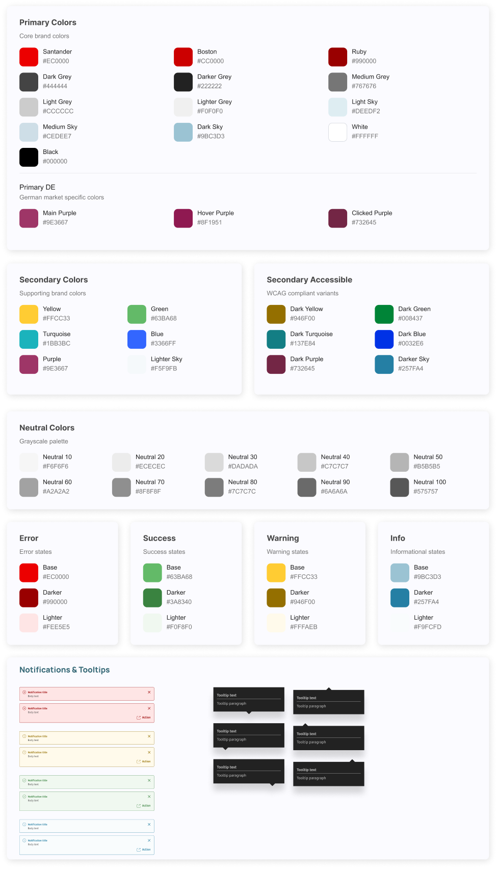
Redesigned patterns, components, and states to ensure consistency across all features.
Delivered a modern, accessible UI aligned with Santander's visual language.
1
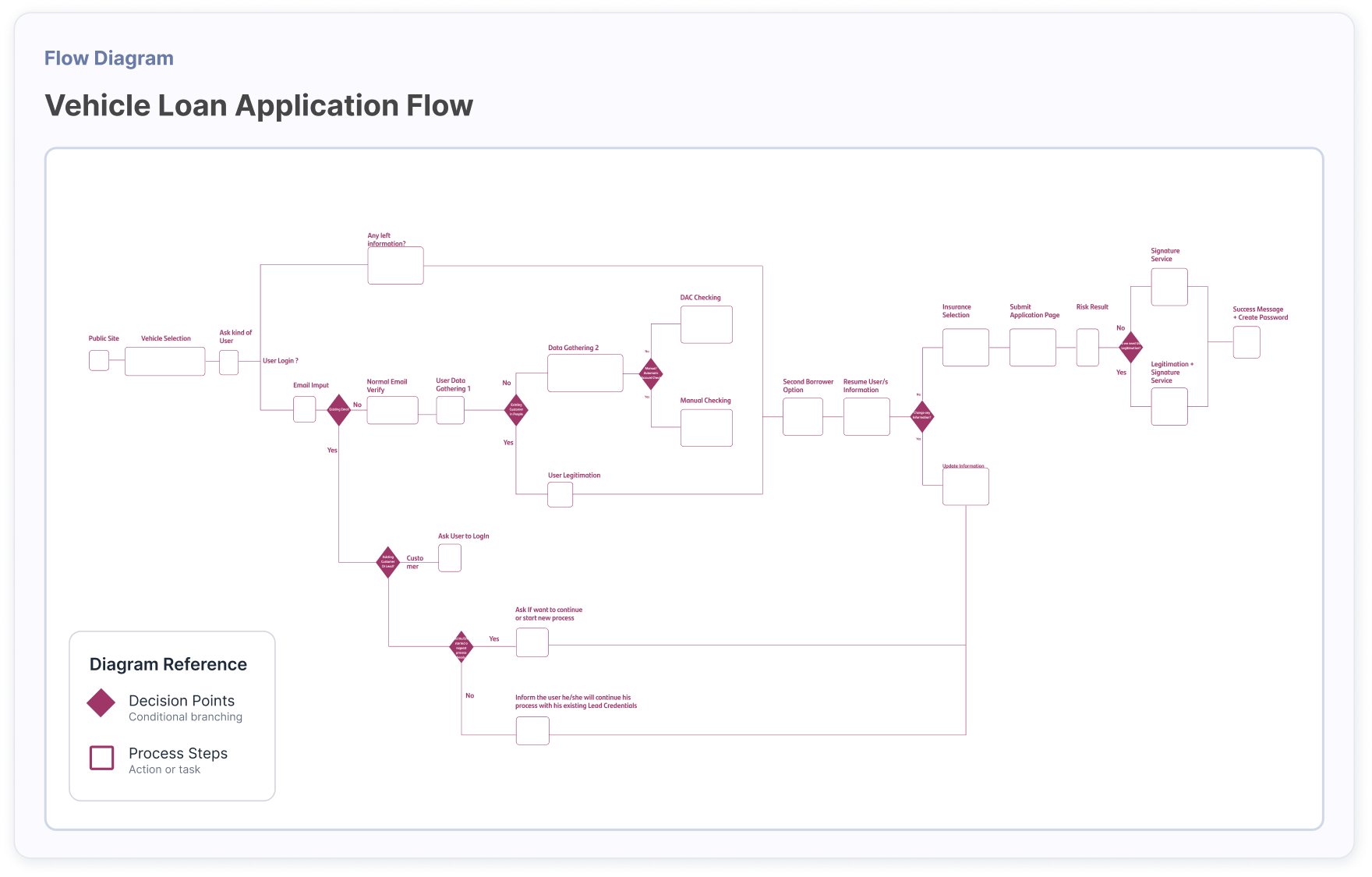
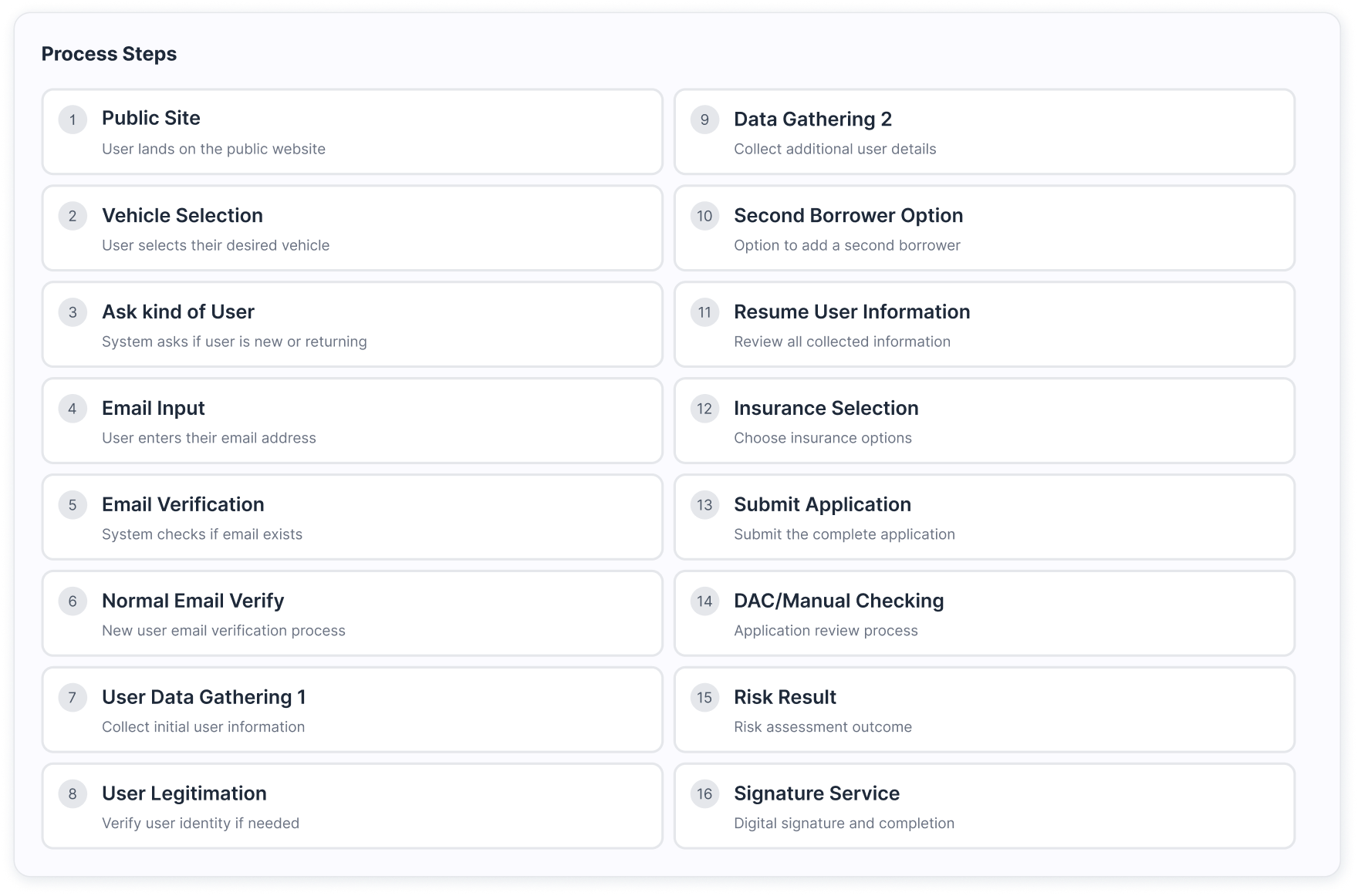
Map the actual product ecosystem
Audited all legacy flows, identified overlaps, and analysed where users struggled most.
Insight: fragmentation wasn't a UI issue, it was structural.
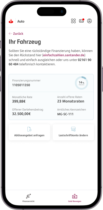
Example: Auto flow (1/4 core products)
2
Redefine the information architecture & navigation
Created a single, predictable structure that grouped tasks logically and reduced unnecessary branching.
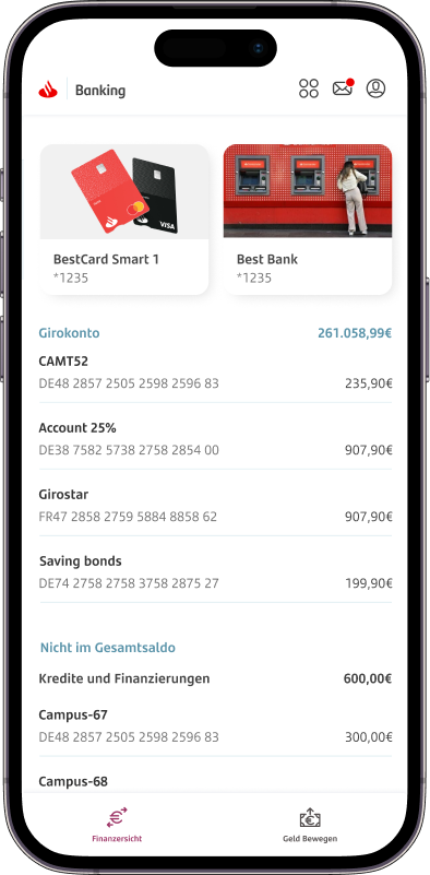
We consolidated 9 scattered products into 3 clear core products, creating a more coherent and scalable structure. Within these, defined 14 well-structured categories, organized around real user needs rather than internal logic.
To support this structure, product switching was placed under a dedicated Products entry in the main menu, used only when needed, since users rarely move between products. For everyday navigation, the bottom navigation bar was redesigned to surface the key categories directly, enabling faster and more intuitive access to the most frequent actions.
The result was a simpler mental model, clearer navigation, and a significantly more usable app structure.
Goal: one product, one mental model.
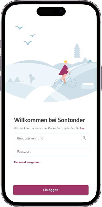
MySantander


Profil


Postbox


Global navigation items
Banking


Auto


Produkte


Core products

Finanzersicht

Geld Bewegen

My products

Services

Verkaufsanfrage

Kredite

Kreditkarten

Bankkonten

Sparen & Anlegen

Versichern

Overview

Inspiration

Meine Bestellungen

Zahlungsarten
Product categories


Banking

Auto

Produkte
Product switcher
Produkte


Overview

Inspiration

Meine Bestellungen

Zahlungsarten

Produkte


Banking

Auto

Produkte

Overview

Inspiration

Meine Bestellungen

Zahlungsarten

Navigation structure
4
Iterate through usability testing
Ran multiple sessions with different stakeholders to validate navigation, flow clarity and terminology. Also used tools like Useberry and Adobe Target.
Simplified steps, reduced friction, and clarified actions based on real behaviour.

Outcome
MySantander became the single digital entry point for Santander Germany, replacing years of fragmented experiences with a cohesive, user-centric app.
It delivered
Clear, predictable navigation across all banking tasks
Consistent behaviours and patterns
Reduced friction in key flows
A modern interface aligned with brand and accessibility
A scalable foundation for rapid feature development

Back to Portfolio
Want to check other projects?
View RustSkill
View Hipoges
Back to Portfolio
Digital Banking
Mobile App
Design System
MySantander App
A consolidated mobile banking experience that replaces multiple fragmented tools with one coherent, scalable platform for customers and internal teams.

Context
Santander Germany operated multiple digital tools with different interfaces, patterns, and logic. Users constantly switched between them, struggling to form a consistent mental model and often abandoning tasks due to fragmentation and complexity.
Redesigned the full mobile banking experience, creating a unified navigation system that brings all services together into one coherent, scalable structure—replacing multiple disconnected entry points with a single, intuitive flow.

Role
UX Designer, UI, research, user flows, design system.
Timeline
2021 - 2024
Team
Product, engineering, brand & compliance teams across multiple workstreams.
Scope
Transform a scattered ecosystem into one unified, intuitive banking experience.
Impact
Redesigned the full mobile banking experience, creating a unified navigation system that brings all services together into one coherent, scalable structure—replacing multiple disconnected entry points with a single, intuitive flow.
Key Problems Identified
For users
Inconsistent flows and terminology
No clear structure across tools
High cognitive load during multi-step tasks
Confusion between overlapping features
For the business
Hard to scale new features across products
Increased support due to interface-driven issues
Redundant development effort
Weak alignment with brand and accessibility standards
My approach
5
Collaborate across product, development and compliance
Aligned technical feasibility, regulatory constraints and delivery phases to ensure the new experience could realistically scale.
3
Redesign and adapt the design system to the german market
Redesigned patterns, components, and states to ensure consistency across all features.
Delivered a modern, accessible UI aligned with Santander's visual language.
1
Map the actual product ecosystem
Audited all legacy flows, identified overlaps, and analysed where users struggled most.
Insight: fragmentation wasn't a UI issue, it was structural.
Example: Auto flow (1/4 core products)
2
Redefine the information architecture & navigation
Created a single, predictable structure that grouped tasks logically and reduced unnecessary branching.
We consolidated 9 scattered products into 3 clear core products, creating a more coherent and scalable structure. Within these, defined 14 well-structured categories, organized around real user needs rather than internal logic.
To support this structure, product switching was placed under a dedicated Products entry in the main menu, used only when needed, since users rarely move between products. For everyday navigation, the bottom navigation bar was redesigned to surface the key categories directly, enabling faster and more intuitive access to the most frequent actions.
The result was a simpler mental model, clearer navigation, and a significantly more usable app structure.
Goal: one product, one mental model.
MySantander
Profil
Postbox
Global navigation items
Banking
Auto
Produkte
Core products
Finanzersicht
Geld Bewegen
My products
Services
Verkaufsanfrage
Kredite
Kreditkarten
Bankkonten
Sparen & Anlegen
Versichern
Overview
Inspiration
Meine Bestellungen
Zahlungsarten
Product categories
Banking
Auto
Produkte
Product switcher
Produkte


Overview

Inspiration

Meine Bestellungen

Zahlungsarten

Produkte


Banking

Auto

Produkte

Overview

Inspiration

Meine Bestellungen

Zahlungsarten

Navigation structure
4
Iterate through usability testing
Ran multiple sessions with different stakeholders to validate navigation, flow clarity and terminology. Also used tools like Useberry and Adobe Target.
Simplified steps, reduced friction, and clarified actions based on real behaviour.
Outcome
MySantander became the single digital entry point for Santander Germany, replacing years of fragmented experiences with a cohesive, user-centric app.
It delivered
Clear, predictable navigation across all banking tasks
Consistent behaviours and patterns
Reduced friction in key flows
A modern interface aligned with brand and accessibility
A scalable foundation for rapid feature development
Back to Portfolio
Want to check other projects?
View RustSkill
View Hipoges
Back to Portfolio
Digital Banking
Mobile App
Design System
MySantander App
A consolidated mobile banking experience that replaces multiple fragmented tools with one coherent, scalable platform for customers and internal teams.

Context
Santander Germany operated multiple digital tools with different interfaces, patterns, and logic. Users constantly switched between them, struggling to form a consistent mental model and often abandoning tasks due to fragmentation and complexity.
Redesigned the full mobile banking experience, creating a unified navigation system that brings all services together into one coherent, scalable structure—replacing multiple disconnected entry points with a single, intuitive flow.

Role
UX Designer, UI, research, user flows, design system.
Timeline
2021 - 2024
Team
Product, engineering, brand & compliance teams across multiple workstreams.
Scope
Transform a scattered ecosystem into one unified, intuitive banking experience.
Impact
Redesigned the full mobile banking experience, creating a unified navigation system that brings all services together into one coherent, scalable structure—replacing multiple disconnected entry points with a single, intuitive flow.
Key Problems Identified
For users
Inconsistent flows and terminology
No clear structure across tools
High cognitive load during multi-step tasks
Confusion between overlapping features
For the business
Hard to scale new features across products
Increased support due to interface-driven issues
Redundant development effort
Weak alignment with brand and accessibility standards
My approach
5
Collaborate across product, development and compliance
Aligned technical feasibility, regulatory constraints and delivery phases to ensure the new experience could realistically scale.
3
Redesign and adapt the design system to the german market
Redesigned patterns, components, and states to ensure consistency across all features.
Delivered a modern, accessible UI aligned with Santander's visual language.
1
Map the actual product ecosystem
Audited all legacy flows, identified overlaps, and analysed where users struggled most.
Insight: fragmentation wasn't a UI issue, it was structural.
Example: Auto flow (1/4 core products)
2
Redefine the information architecture & navigation
Created a single, predictable structure that grouped tasks logically and reduced unnecessary branching.
We consolidated 9 scattered products into 3 clear core products, creating a more coherent and scalable structure. Within these, defined 14 well-structured categories, organized around real user needs rather than internal logic.
To support this structure, product switching was placed under a dedicated Products entry in the main menu, used only when needed, since users rarely move between products. For everyday navigation, the bottom navigation bar was redesigned to surface the key categories directly, enabling faster and more intuitive access to the most frequent actions.
The result was a simpler mental model, clearer navigation, and a significantly more usable app structure.
Goal: one product, one mental model.
MySantander
Profil
Postbox
Global navigation items
Banking
Auto
Produkte
Core products

Finanzersicht
Geld Bewegen
My products

Services
Verkaufsanfrage

Kredite
Kreditkarten
Bankkonten
Sparen & Anlegen
Versichern

Overview
Inspiration
Meine Bestellungen
Zahlungsarten
Product categories
Banking
Auto
Produkte
Product switcher
Produkte
Overview

Inspiration
Meine Bestellungen
Zahlungsarten
Produkte
Banking
Auto
Produkte
Overview

Inspiration
Meine Bestellungen
Zahlungsarten
Navigation structure
4
Iterate through usability testing
Ran multiple sessions with different stakeholders to validate navigation, flow clarity and terminology. Also used tools like Useberry and Adobe Target.
Simplified steps, reduced friction, and clarified actions based on real behaviour.
Outcome
MySantander became the single digital entry point for Santander Germany, replacing years of fragmented experiences with a cohesive, user-centric app.
It delivered
Clear, predictable navigation across all banking tasks
Consistent behaviours and patterns
Reduced friction in key flows
A modern interface aligned with brand and accessibility
A scalable foundation for rapid feature development
Back to Portfolio
Want to check other projects?
View RustSkill
View Hipoges